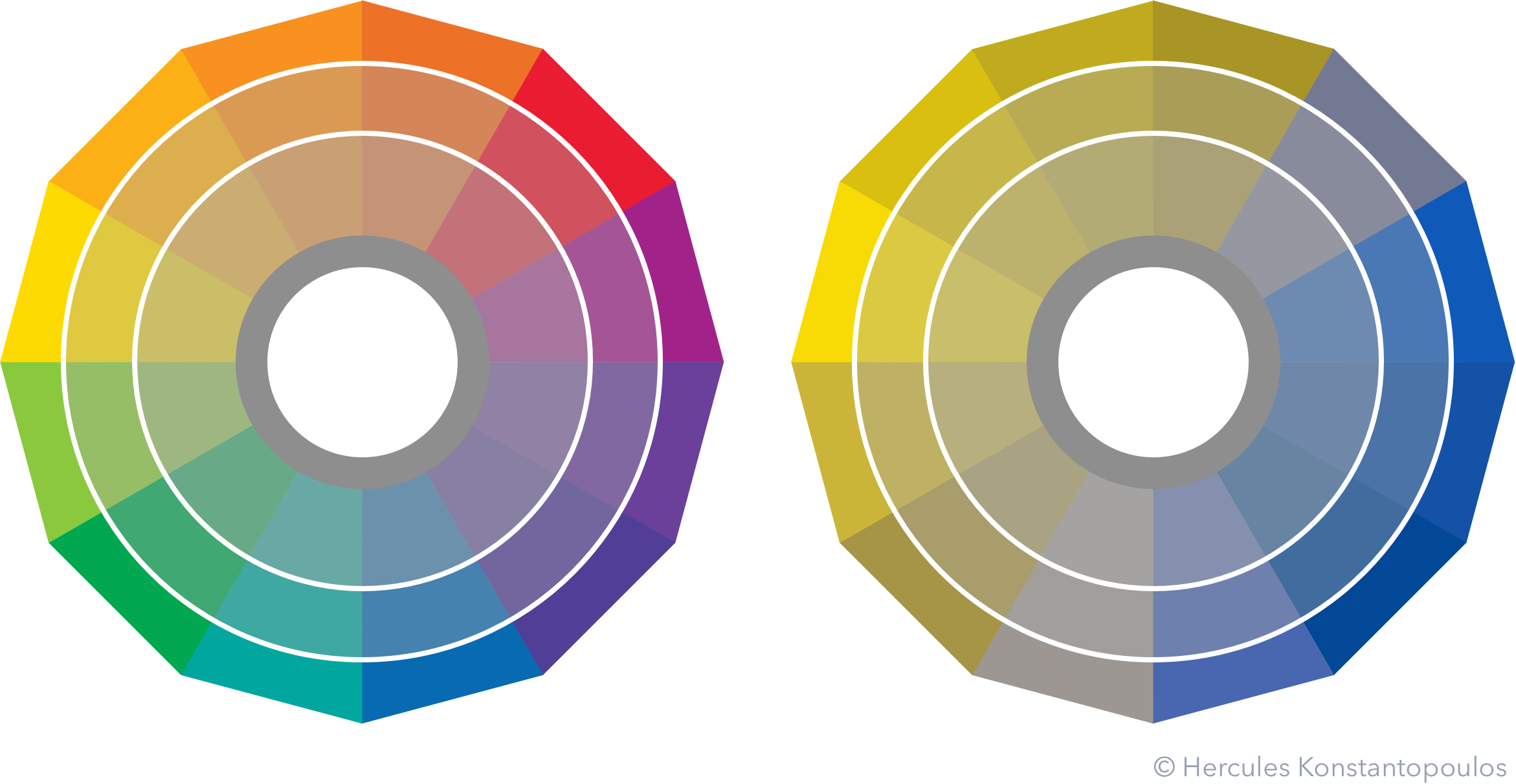
From the brilliant blue hue of a young star to the ominous glow of a red dwarf there are so many colours for designers to imbue their imagery with meaning—even ones not related to the temperature of stars!
It may, however, come at a cost. Some 95% of us can take colour for granted, but around 10% of men (and 100% of puppies) do not perceive hue the same way: there are a few forms of colour deficiency or colourblindness that change one’s perception of colourful imagery.
In art there are a many good examples. Consider the explosion of colour in Kandinsky’s Concentric Circles. What would happen if we were to simulate deuteranopia, a common form of colourblindness?
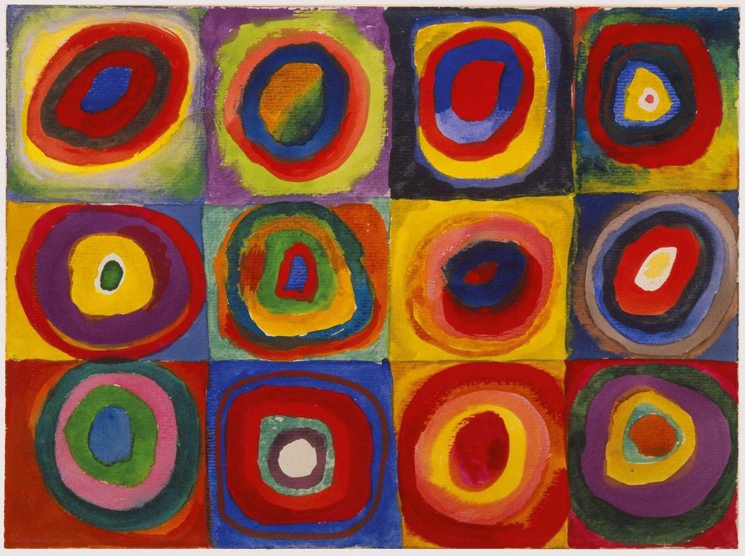
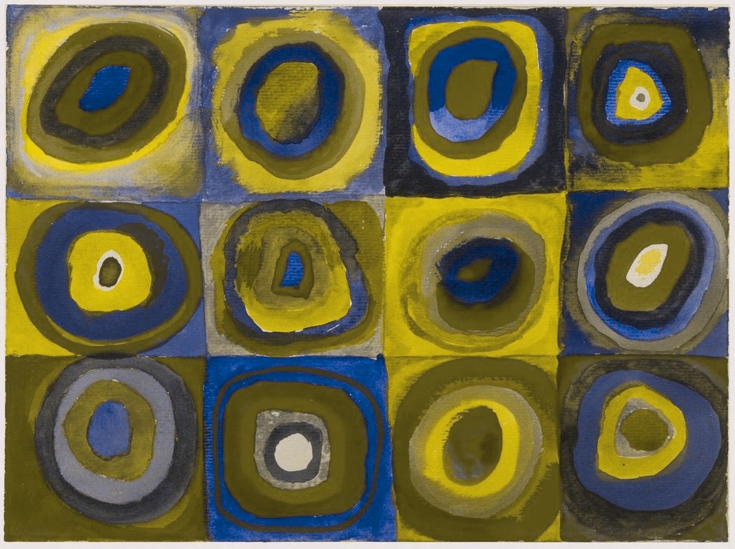
I fetched the original from http://www.wassilykandinsky.net and used rehue.net to alter the colours. (Check out this post for a fantastic exploration of the work of Van Gogh in this context.)
But surely data visualisation does not depend on colour as strongly as art… does it?
Let’s look at the default palettes for a few commonly used vis tools. How do they change when we simulate deuteranopia in the bottom rows?
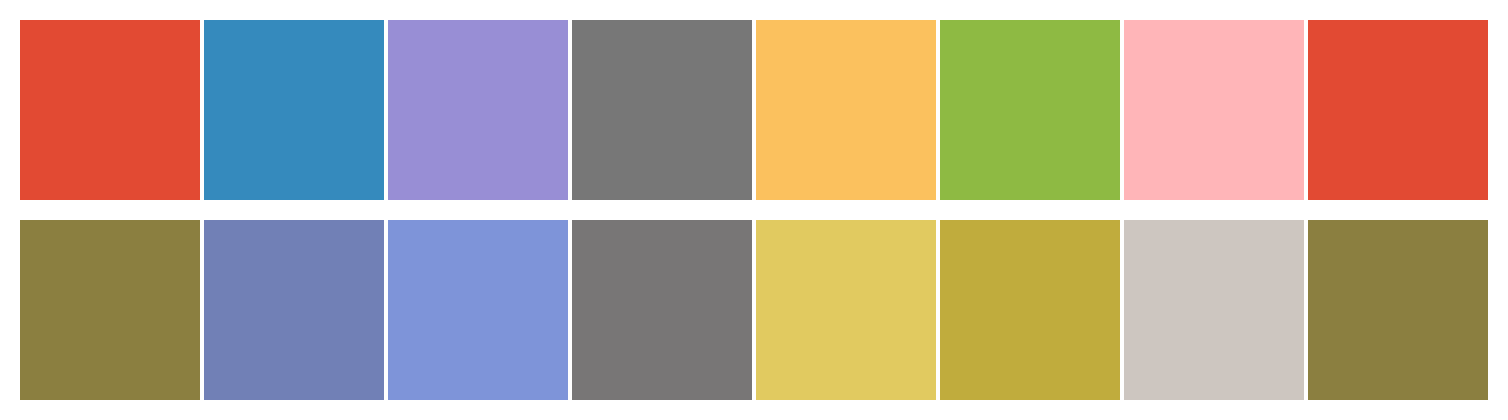
Seaborn (Python):
Redash:
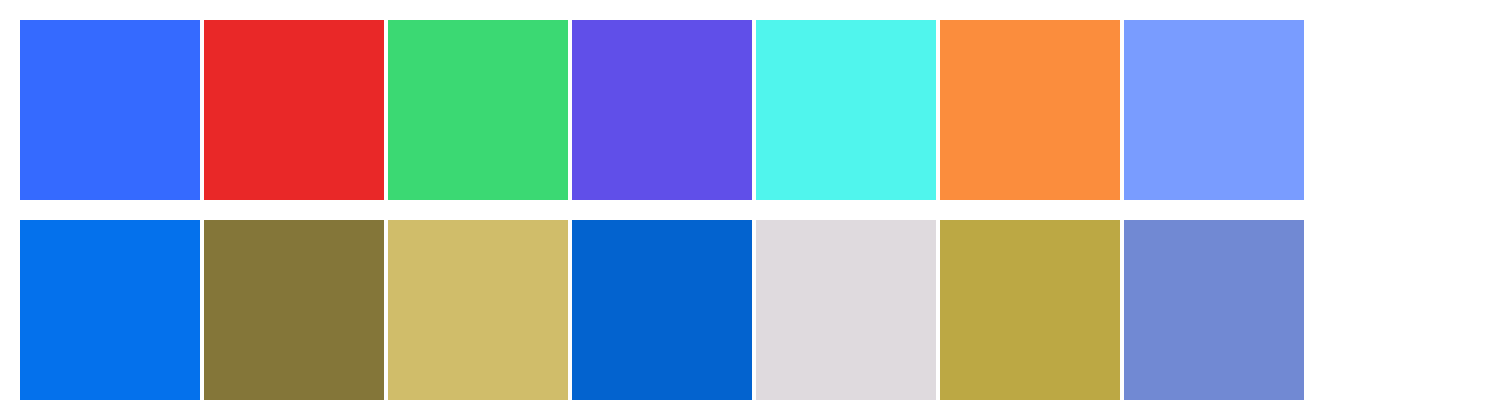
If we mean for a generic audience to distinguish categories based on colour alone, we have immediately lost up a bunch of people. As an illustration of how tricky this can get, even tools that try to fix this problem can fall short.
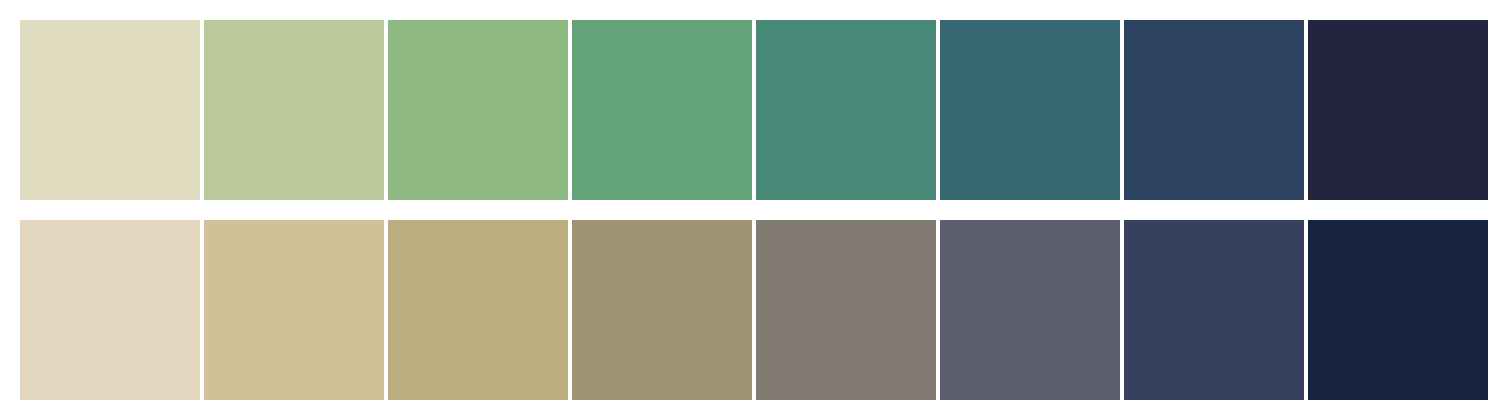
Colourblind-friendly palette for ggplot2 (R):

The hues are fairly distinct but the two yellowish browns and two brownish greys make it so that a colourblind reader would have to constantly refer back and forth to the legend… it is not ideal vis design.
Start with quantifying colour
To make visuals clearly interpretable it helps to employ a value-continuous colour palette. Let me explain.
Hue, saturation, and value are the three properties of colour that make the HSV system. I like this because, well, I’m a scientist and I am not the best of friends with ambiguity! HSV is very neat and tidy:
Hue

A synonym for the wavelength of a given colour—e.g., yellow, red, or blue.
Saturation

The intensity of a colour (same as chroma). Imagine fading to grey.
Value

The lightness or darkness of a hue. Imagine in greyscale to rationalise.
If a colour palette presents colour in a monotonic sequence of values (i.e., white, light grey, dark grey, black) then anyone can interpret them consistently, even if they perceive them differently. Isn’t that groovy?
A great example is the cubehelix palette. Here is the subset of hues I use:
The top and bottom row may not be identical, but they will be perceived in a coherent fashion. This is a great palette to use for continuous variables, for example a colour map that tracks a certain metric over different areas.
For discrete variables the plot will need some more hues. Cubehelix can provide this, as can the ggplot2 palette presented above, and the viridis palette that is implemented in matplotlib.
I wanna colour for puppies, too!
You’re in the right place. The machinery I employ is simple to adopt and does not disrupt the design flow.
My main tool is Color Oracle, a very simple widget that simulates various forms of colourblindness live, on-screen, with a single button click. This way I can keep iterating in any app until I can see all the meaning myself.
Then there is rehue.net, which allows me to save a simulated image so I can, for example, demonstrate my choice of palette to stakeholders.
That is really all it takes! The outcome is phenomenal and the effort minute. A winning move for any vis designer!