
Looking for the the repo or the journal article? If not, read on for an explainer.
Statistics is concerned with the study of populations. Be they particles, single cells, people, or galaxies, the study of individuals can be just as meaningful as the overall sample.
This is the brief I got when I was asked for a visual inventory of galaxies in the SAMI survey, a huge collaboration of astrophysicists across a few continents. I was to produce an inviting lookup table that combined galaxy pictures (hyper-spectral imaging) along with some listed stats. I argued that the set of pretty pictures of galaxies would not mesh well with tabulated numbers—not only in terms of visual design, but also for context.
Context is half the battle
How many news articles have you read about the biggest whatever in the country / world / universe. True enough, a report about the world’s tallest human does not need context: we know how tall people tend to be so we have a statistical intuition of sorts.
What about the most massive black hole in the universe? If an article were to misreport the number by six orders of magnitude, non-specialist readers would not be able to spot that. After all what’s a million suns between friends?
Here’s Wally
(Or Waldo, depending on where you grew up).
What we need in most circumstances is to simultaneously visualise the individual as well as its parent population. That is the objective of the Starfish diagram.
Each leg is a histogram.
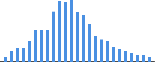
Instead of sitting on the x-axis, the bars are balanced symmetrically across it. (For the vis nuts out there: if we were to plot the kernel density it would be violin plot).
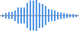
We can drop the axis line since the bars clearly imply its presence, just for styling. The final touch is to indicate where the individual lies: just circle the histogram bin.

Then we rotate each leg to provide the overall arrangement, and that’s it. Simple!
The sky is the limit in terms of applications
This technique can be applied to any situation where an individual needs to be placed in a greater context. The design partly drew inspiration from video games so I made a school of starfish on basketball stats for the original journal article. But there are really no limits here. This can be used by demographers, scientists, product analysts, statisticians, you name it.
If this sounds useful just get in touch : )
