
Around 2012 a design term briefly entered the mainstream: Skeuomorphism (pronounced skevvo-morphism) is the practice of adorning a modern machine or device by adapting the appearance of a predecessor. Think of a filament light bulb that’s made to look and flicker like a candle. Or, beyond visuals and into product design, the shutter click sound effect on a mobile phone camera.

In my neck of the woods the impetus for this discussion was Apple’s depiction of a reel-to-reel recorder as the graphic to an obviously digital playback app on iOS. (Image: newatlas.com).
I wasn’t crazy about this form of imitation for the same reason I wouldn’t go for a fake woodgrain print or vinyl that pretends to be leather.
This form of denotation elicits strong reactions but it has some merit in that it carries a strong connotation. It is arguable whether young people in 2012 would have recognised reels, or even fathomed why one might imprint information on a laminated strip of plastic and rust. But even outdated media carry connotative value—think of the floppy disk as a ‘save’ button—and that gives designers plenty to work with.
The clock as the ultimate universal data vis abstraction
I find it amazing that people can still read clocks. This debatably obsolete mechanism is itself an evolution of a previous medium: the round clock face is a very elegant abstraction of a sundial. The etched sun arc transforms into a closed loop and the upright dial becomes a set of coplanar digits. It takes the connotation of a sundial and internalises it into a new design. No skeuomorphism here, just evolution. Genius, really.
Plotting call centre traffic
Tracking progress over time is a basic business requirement. Stock prices over the past week, or sales over the course of a year are some very commonly requested timelines. On a few occasions I have been asked to visualise the daily cadence of some process. For example, how are customer interactions spread over the course of a day?
The default choice would be a scatter plot or a bar chart. If depicting a timeline hour-by-hour it would be appropriate to use a bar chart in order to show the discretisation of the data source. In the following example I have mocked up a data source based on a client who wanted to track call centre volume over the course of a typical day.
Let’s have a go with the basic representation of a timeline, the bar chart:
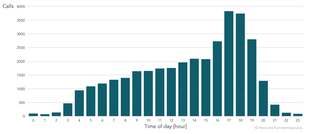
It’s not bad, it does the trick. It is a little challenging to split morning from afternoon, so let’s add another dimension for that:
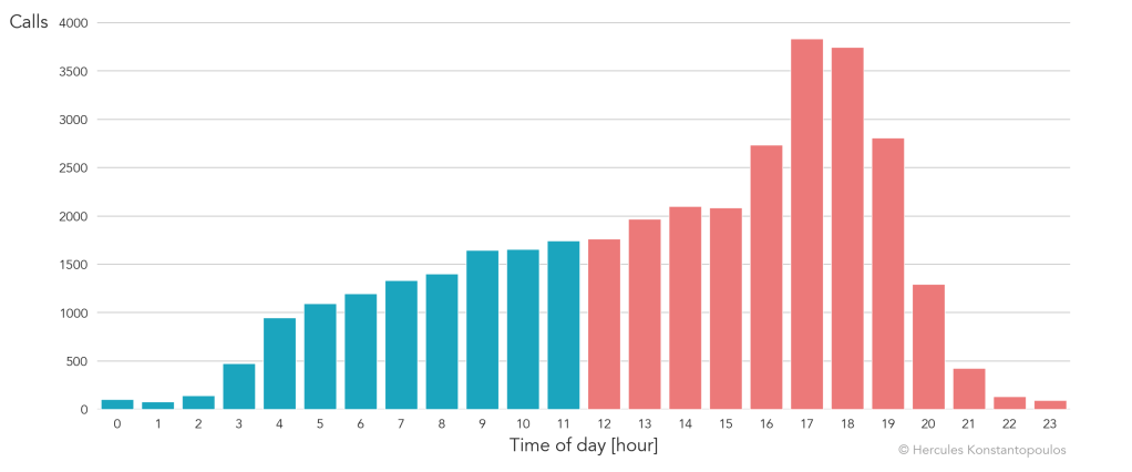
That’s a little clearer but not terribly exciting. If the relative volume is what we are after we can do much better. This is a representation of time of day, not an extended period. And the goal is not to count precisely how many calls the centre receives but to identify busy times.
Back to the clock
Going back to the clock this is the rather Spartan design I delivered:
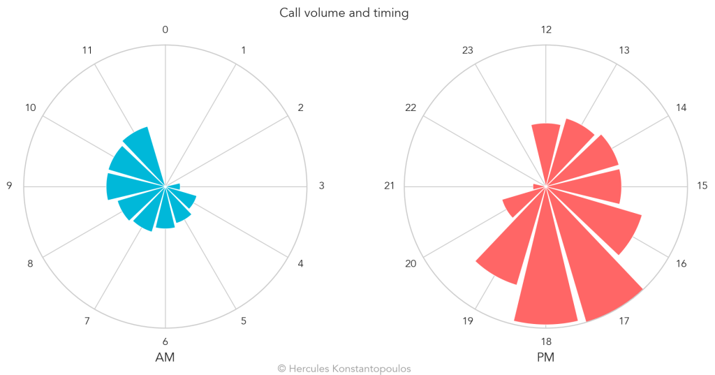
We have a clock face and we have wedges whose lengths represent the call volume at a given time of day—all in a cute, round package! The r-axis (length along the radius) is scaled the same way in the a.m. and p.m. clocks to avoid misinterpretation.
There are a few options here for indicating call volume. I went with the wedges as an aesthetic choice but simple bars would have been just fine. The grid lines are another choice here: we could draw lines along the sides of the wedges, rather than the centre to accentuate the fill factor. In this case that was busier than the client desired.
The one element we lost here is quantification. If we want to know how many calls the centre received we can add some gridlines and labels:
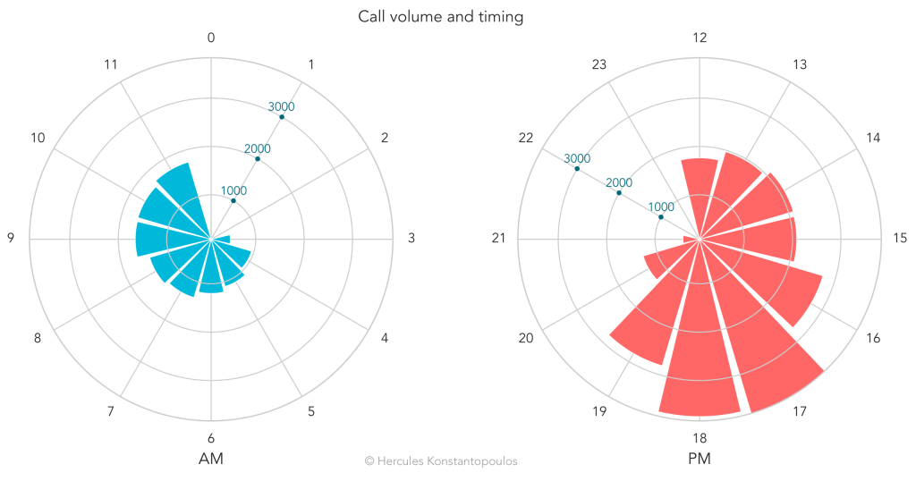
For some folks this design might carry the extra connotation of a radar, which would increase cognitive load at the first interaction with the plot. That’s not ideal. So, to keep this from getting too busy I placed the tick lines on top of the wedges but kept the hour lines underneath. This reinforces the wedge as the ‘show’ here and relegates the grid to a supporting role. We could also restrict the gridlines to only mark the tops of the wedges in order to have our pie and eat it.
The numeric labels along the r-axis are not my favourite. It would be nice to place them in a box for contrast but I found it difficult to do so without drawing focus away from the wedges. Since the client did not ask for quantification I never crafted all of this ¯\_(ツ)_/¯ but as always, writing up a project makes me want to take it further!
Evolution without loss of connotation
Another iteration of this, useful if space is limited, is a 24-hour dial:
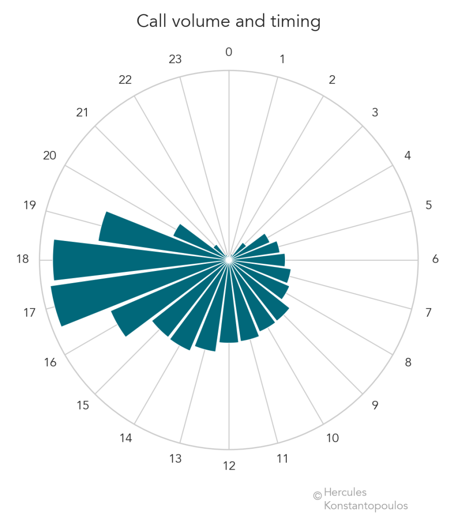
Here the division into morning and afternoon is conceptually simple: just a left-right juxtaposition along a vertical diameter. As above we could add tick labels along the r-axis to quantify.
In terms of the aesthetics specific to this data source, we no longer lose the continuity of the wedges, which create a striking , sort of sea shell design. It’s great when data end up looking nice!
Connotation makes for some great data vis shortcuts. This is why infographics work so well! Without fully stepping into that realm, we data vis designers can learn a lot from it: take a concept that is understood by our audience and adapt it into a depiction of hard data.

I love this. How did you do it?
LikeLike
Thank you! It’s all done in Python. I should post some code, I’ve wanted to create a repo for the work on this site for a while.
LikeLike